
reach52 x United Nations Partner
Web Dashboard & Mobile Application
Vaccine Information
Management (VIM)
introduction

role
UX & UI Designer
Context
Vaccine Information Management (VIM) is reach52's platform, deployed in partnership with the United Nations. reach52 trains local community members as health workers to support vaccination and immunisation in their underserved communities across Asia, while admins use VIM to manage and oversee that delivery at scale.
Problem
Health workers lost time to an inconsistent, hard-to-navigate app, working in the field with no clear way to track which data had been synced. Admins dug through fragmented data with no clear hierarchy, making it hard to know what actually needed their attention.
What i did
As the sole designer on VIM, I owned the redesign from research through release and iteration, across every screen on both platforms.
Mobile Application
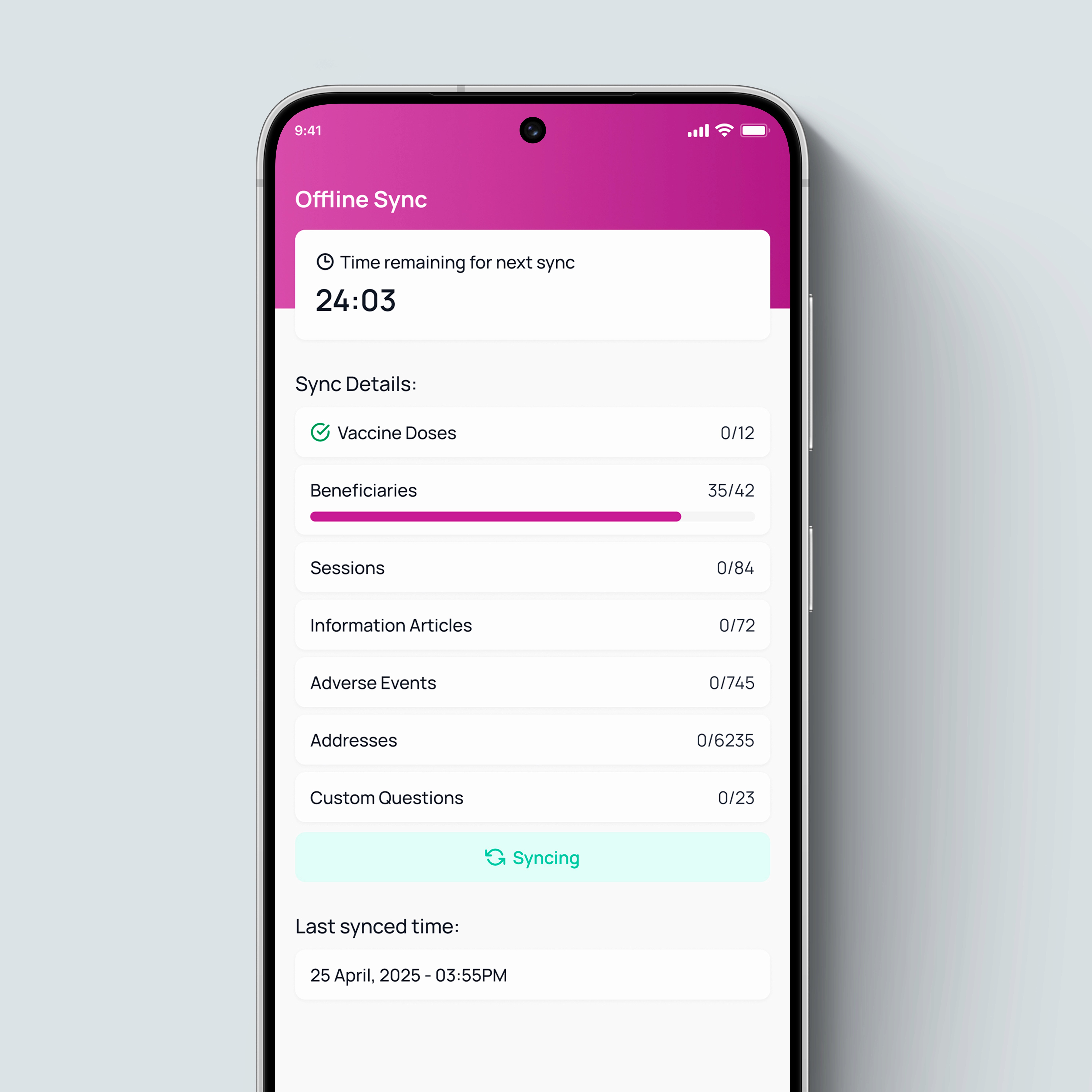
Rebuilt how health workers register residents, update immunisation records, and track who needs vaccine doses, working within the app's offline-first constraint for low-connectivity areas, and added new features like sync status and information screens.
Web Dashboard
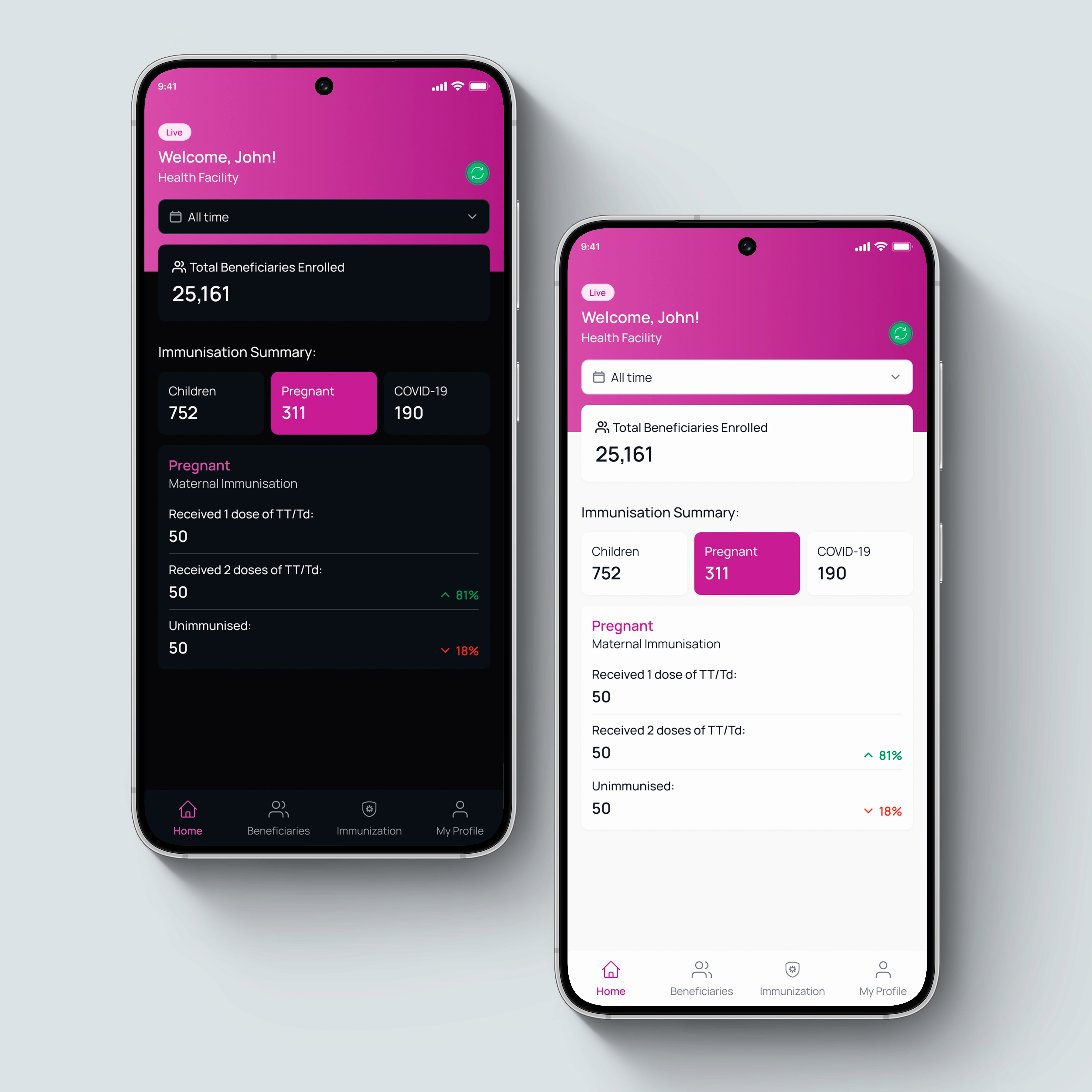
Redesigned the admin experience to give teams real oversight across immunisations, divisions, facilities, vaccines, and beneficiaries at scale. I also built a clearer export and download report flow and a detailed vaccine side effect records (adverse event) screen.
broad impact
highlight




Role & Contribution
Reach52's community teams ran on-the-ground research across multiple regions to understand how health workers and admins were actually using the VIM platform. My work picked up from there, taking scattered field input and shaping it into a direction the team could build on.
field team
my ownership
Reflect
In many rural communities across Asia, access to basic healthcare isn't a given. VIM started as a single-country deployment in Myanmar, small enough that gaps in the platform were easy to work around.

problem space
mobile application
Too Many Steps
Jumping between sections to complete one update cost several extra minutes per task.
Unclear Sync Status
No confirmation a record had synced, leaving users unsure if their work was recorded.
CTA Placement
Buttons needed to move forward were often buried, missing, or placed on the wrong screen.
Interruptive Pop-ups
A popup on multiple input fields broke the flow of a task that should've taken seconds.
No Clear Hierarchy
Screens gave no indication of what mattered most or where to go next, confusing users.
02
Unclear Sync Status
No confirmation a record had synced, leaving users unsure if their work was recorded.

Web dashboard
No Overview Page
No dedicated summary page existed, so admins had to piece information together by checking multiple screens one by one.
Data Priority
Data was overloaded and unstructured. Important data went unnoticed and delayed managerial decisions.
Unreliable Data Export Flow
Admins had to export or download reports through a difficult sidebar navigation flow instead of a quick overlay pop-up.
Incosistent Patterns
Every screen followed a different flow or layout, forcing admins to relearn and adjust to the interface constantly.
Limited View of Adverse Events
No dedicated space existed for adverse event records, so critical side effect details often went missing or overlooked.
02
Unclear Sync Status
No confirmation a record had synced, leaving users unsure if their work was recorded.

constraints
design direction
multiple iterations
I worked with the product team to run stakeholder sign-off across reach52's tech, development, and business teams, and the UN, each with different priorities, through several rounds before we landed on one clear direction.
marketing and business
Beyond health workers and admins, the rebuild had to support a wider ecosystem of facilities and partners, and hold up as a foundation reach52 could use to attract more funding organisations.
ecosystem
Mobile handles data capture on the ground; web handles centralised oversight and management. Bidirectional sync keeps both aligned in real time.

final design
My designs needed to tackle the problems previous versions of both mobile and dashboard surfaced, and account for constraints health workers actually worked in. My goal was to make both platforms accessible and easier to use for health workers and admins alike.
I built every screen using reach52's design system, which I created from scratch, replacing inconsistent, hard-to-navigate screens with consistent patterns, cleaner structure, simplified flows, and clearer hierarchy for both mobile and web.


visual design
foundations
I defined colour tokens, typography scale, icons, spacing, focus rings, blurs, shadows, radius, and grid once, then applied them consistently across every platform.
components
I documented buttons, inputs, modals, tables, navigation patterns, cards, and status indicators, each with its own properties and variants.
cross-platform consistency
Every component shared one visual language across mobile and web, the same patterns, terminology, and hierarchy wherever possible.


results
Getting reach52's teams, the UN, and partner doctors on the same page took several rounds before one direction held. Now, with an HCI background and hands-on experience managing that kind of alignment, I treat it as part of the design process, not something to rush past.
In numbers by Aug 2025:

Other projects

Built a unified platform for reach52 to run health events and campaigns for underserved communities at scale.
reach52
Coming Soon
